V&A Museum
Exhibition Pages
Context
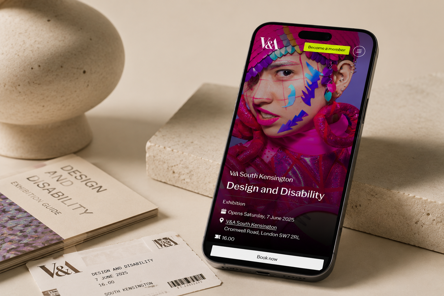
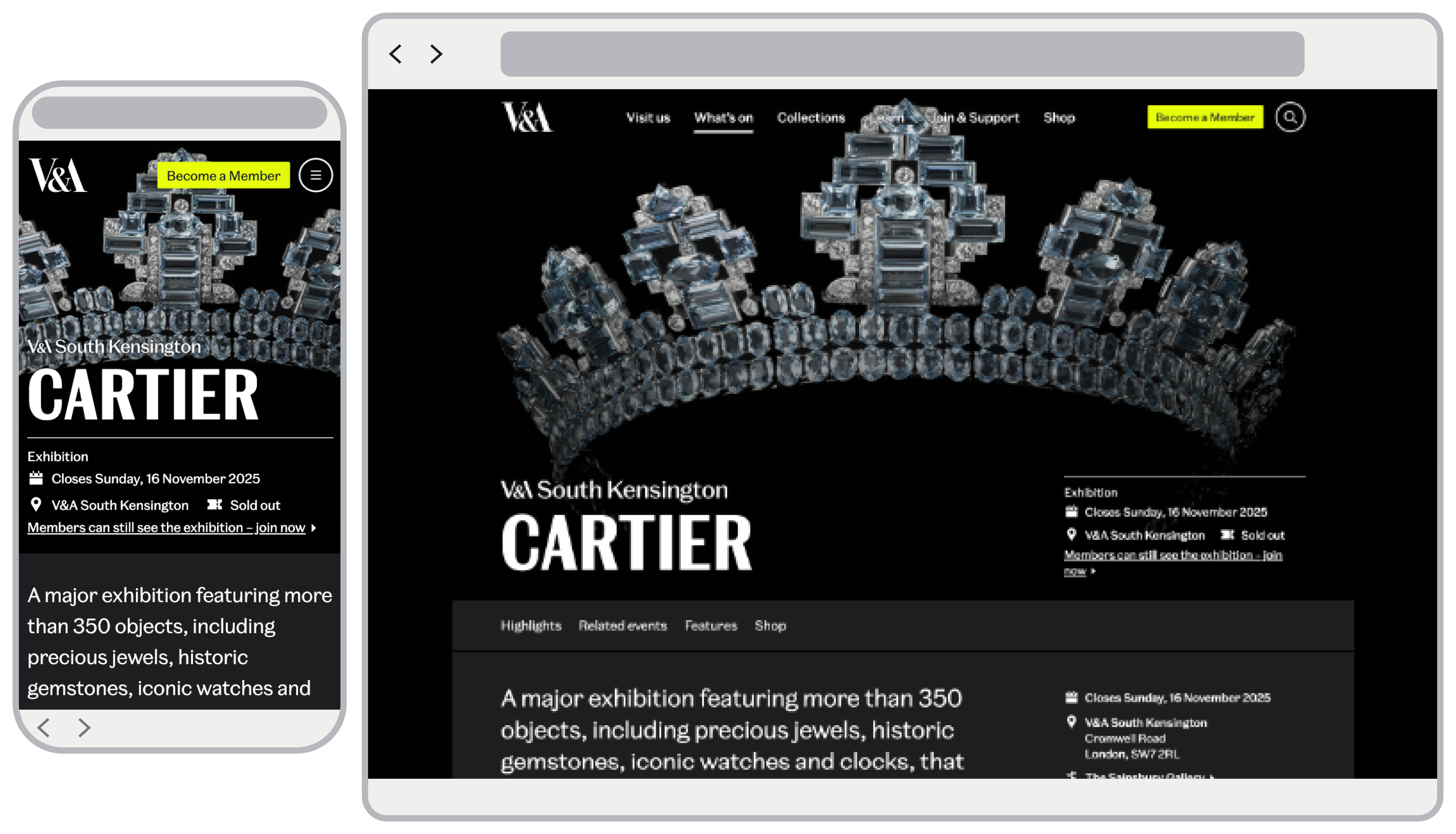
The V&A runs numerous exhibitions across its venues, but the existing Exhibition Pages primarily prioritised ticket sales. Memberships, a key commercial goal for the museum, were treated as secondary, and the experience was not optimised for mobile, despite the majority of visitors browsing via phones.
The redesign of the Exhibition Pages aimed to rebalance priorities, promoting memberships alongside ticket sales, improving mobile usability, and boosting newsletter sign-ups throughout the exhibition lifecycle.
Design complete; awaiting deployment.
Problem
Research and stakeholder feedback revealed key pain points that limited commercial and user experience potential.
Ticket-first hierarchy
No. 01The design heavily prioritised ticketing, leaving membership and newsletter CTAs hidden.
Mobile experience
No. 02Navigation and CTA access were limited on small screens, despite being the main user platform.
Lifecycle consistency
No. 03Messaging was not aligned across exhibition phases, leading to missed conversion opportunities.
Process
Wireframing and exploration
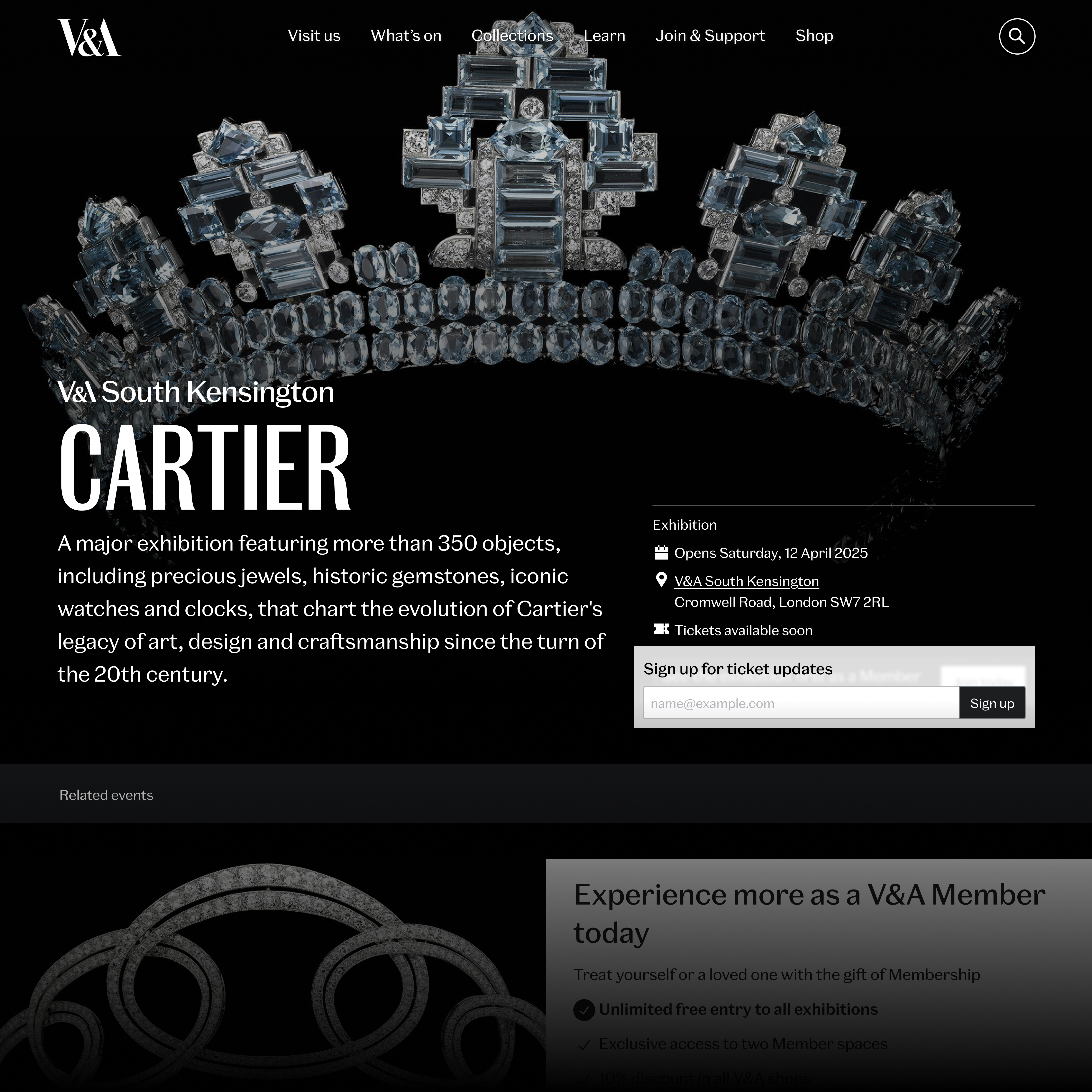
I mapped the full exhibition lifecycle, from announcement to post-opening, to identify key conversion moments. The wireframes explored how the template could adapt its messaging across membership, ticketing, and sign-ups. The process focused on four main areas:
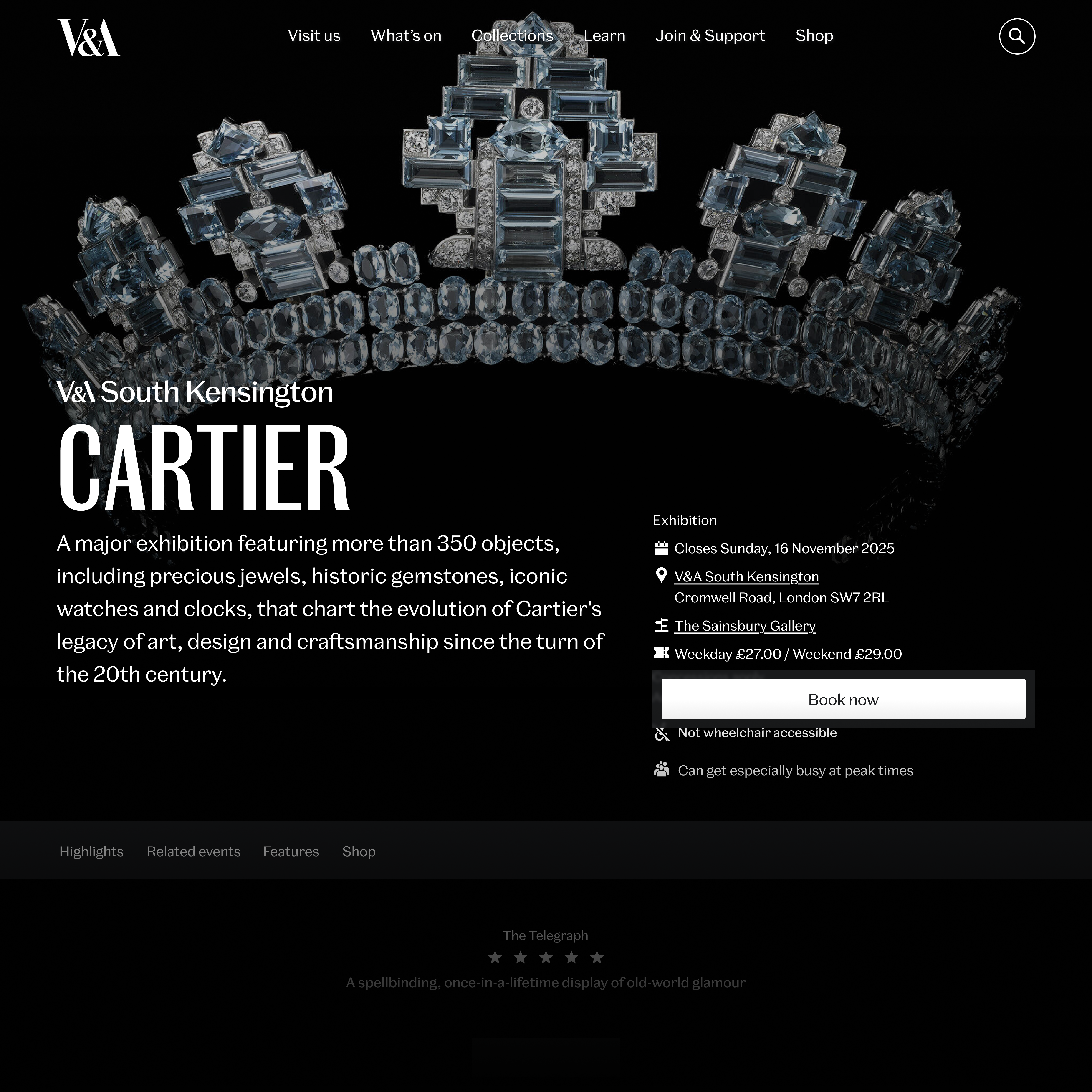
Sticky CTA
A primary button that adapts by phase and ticket availability.
Header & info panel
Merged duplicated content into a single unified header component.
Newsletter and waitlist
One flexible sign-up form, acting as a newsletter pre-launch and a waitlist post-sellout.
Phase-specific layouts
Tailored designs for each exhibition phase to keep visuals consistent and messaging relevant.
Prototyping
Once the wireframes were validated, I developed high-fidelity prototypes to demonstrate how the template dynamically adapted content and hierarchy across lifecycle stages.
Announcement: focused on early engagement through newsletter sign-ups and membership awareness. Tickets on sale date announced: introduced anticipation messaging while maintaining membership visibility. Tickets on sale: switched the primary CTA to ‘Book Tickets’, with membership as the secondary prompt. Open to Public: maintained ticketing priority while reinforcing membership benefits. Sold Out: replaced ticket CTAs with membership and waitlist options to sustain engagement post-sellout.
User testing
I framed the research questions and translated the findings into design decisions. Working with our researcher, we ran unmoderated usability testing with 10 participants (a mix of culturally engaged visitors from the UK and USA). The group included users with a range of interests in art and design, and three participants with accessibility needs, ensuring the study reflected a diverse and inclusive audience. These were the key findings:
Clear exhibition understanding
No. 01Users easily identified exhibition details like theme, location, and cost.
Unclear membership value
No. 02Membership prompts were noticed, but benefits and pricing were unclear.
Newsletter uncertainty
No. 03Users saw sign-up forms but didn’t know what updates they’d receive.
Effective availability cues
No. 04Colour-coded labels (Last Few Tickets, Sold Out) were quickly recognised and understood.
Membership interest after sellout
No. 05Seeing “Sold Out” prompted users to explore membership as an alternative.
Final design
Delivered high-fidelity prototypes in Figma for stakeholder review and developer handoff. The new design introduced:
Mobile-first design improving UX and conversion. A sticky CTA giving continuous access to membership, tickets and sign-ups. Lifecycle-adaptive templates for each exhibition phase. Integrated newsletter and waitlist forms for ongoing engagement.
Accessible, responsive layouts optimised for performance and clarity.
Design complete; awaiting deployment.
Outcome and impact
The clearest outcome is adoption. The template became the V&A’s standard: every exhibition page on the site now runs on it, and it was extended to cover displays as well. A design that started as one page became the pattern the museum publishes through.
I left before the post-launch analytics cycle, so I make no claim about conversion numbers. What I can point to is the design decisions the research produced, and the fact that the institution adopted them wholesale.
Adopted as the standard
Every V&A exhibition page now uses this template, and it was extended to displays.
One page, every phase
A single template that adapts its message from announcement through to sold out, instead of separate builds.
Membership made legible
Testing showed members’ benefits and pricing were unclear, so the offer was rewritten and given a fixed place in the hierarchy.
Sign-ups that explain themselves
Users saw forms but not what they were for, so one flexible form now states what you get, working as newsletter pre-launch and waitlist after sellout.