Case study No. 03 · V&A Museum
What’s On
Context
The V&A runs an extensive programme of exhibitions and events across multiple sites. To support this, a multisite What’s On landing page was introduced in 2023 as the central entry point for visitors to browse upcoming shows.
However, the first implementation quickly ran into problems. The page attempted to load six months’ worth of events at once, resulting in server performance issues and a poor user experience. At the same time, major “blockbuster” exhibitions lacked prominence, meaning key events were being overlooked by visitors.
Recently deployed; iteration ongoing.
Problem
Analytics and user research revealed that visitors struggled with the landing page.
Performance issues
No. 01The page loaded six months of events in a single request, creating server strain and slow load times.
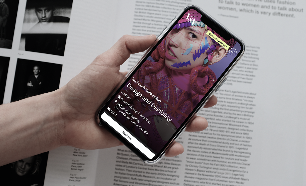
Low visibility for exhibitions
No. 02Flagship exhibitions and events were buried in the feed, with little visual hierarchy to distinguish them.
Limited navigation
No. 03Filters and date ranges weren’t prominent enough, making it harder for users to scan or plan ahead.
Process
Wireframing and exploration
I explored different layout options to solve these issues and rebalance the page hierarchy, giving exhibitions stronger visual priority while still accommodating smaller events. To manage scope and delivery, we divided the redesign into two phases:
MVP
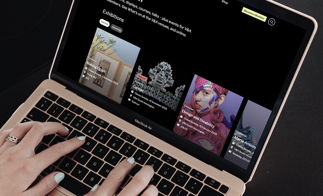
The minimum viable product focused on performance and visibility. It introduced a “Load More” button to reduce server strain and an exhibition carousel at the top of the page to highlight blockbusters, with tabs to switch between current and upcoming exhibitions.
Phase two
Phase two expanded functionality with a refreshed Featured Events component and a new calendar with date-range selection, giving users more control over planning. An Exclusive for Members carousel was introduced at the bottom of the page to highlight membership benefits and drive engagement.
Prototyping
I created high-fidelity prototypes in Figma for cross-team review, focusing on solving immediate user needs and performance issues. The version below represents the MVP, a first step that addressed constraints while laying the foundation for the final design.
Final design
The final design expanded the experience with richer functionality and clearer hierarchy:
An exhibitions carousel with tabbing at the top of the page gives blockbuster events prominence. A refreshed Featured Events component gives mid-tier programming more visibility within the page hierarchy. A calendar with date-range selection lets users plan visits more flexibly beyond the default month view. An Exclusive for Members carousel highlights membership benefits at the bottom of the page, encouraging sign-ups and engagement.
Designs and specifications were delivered in Figma, with detailed guidance on event hierarchy, filtering, and server load behaviour to support a smooth development handoff.
Recently deployed; iteration ongoing.
Outcome and impact
The redesigned What’s On launched on 1 October 2025 as part of a phased deployment. Full metrics arrive with the next analytics cycle; the design was built to deliver:
Improved performance
A lighter load structure reduces server strain and speeds up loading.
Greater visibility
Blockbuster exhibitions surfaced through the carousel and given clear priority.
More flexibility
New calendar with date-range selection supports varied planning styles.
Stronger engagement
Members carousel highlights benefits and encourages sign-ups.