V&A Museum
Explore the Collections
Context
The Victoria and Albert Museum houses millions of objects that tell the story of art, design, and human creativity. Explore the Collections is the museum’s digital front door. It isn’t just a tool to search objects, it’s an experience designed to spark curiosity, support research, and inspire creativity across cultures.
Launched April 2025 · Traffic up 40% and search reliance down 32% over five months
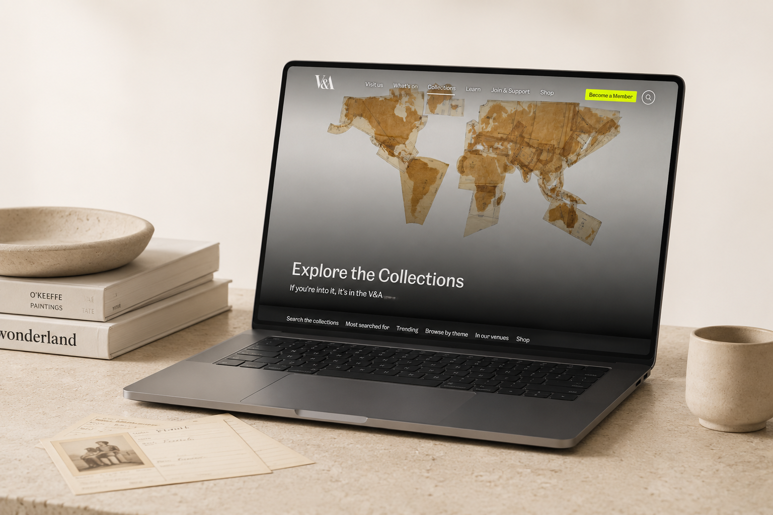
Problem
Analytics reframed the problem. The landing page wasn’t the front door we assumed: 79% of sessions began directly on an object page from Google, and only 8.5% started here. Those who did arrive stayed a while (3m 28s on average), but scroll data showed most never reached the featured collections. Three problems sat underneath this:
Unclear proposition
No. 01Users were unclear about what Explore the Collections actually was (exhibition, database, or museum information). A Hotjar survey put page-purpose clarity at 56% against a 70% target.
Confusing navigation
No. 02Navigation felt overwhelming, with too few “ways in” for casual users who lacked specific search terms.
Accessibility issues
No. 03Users with accessibility requirements faced barriers exploring the collections independently.
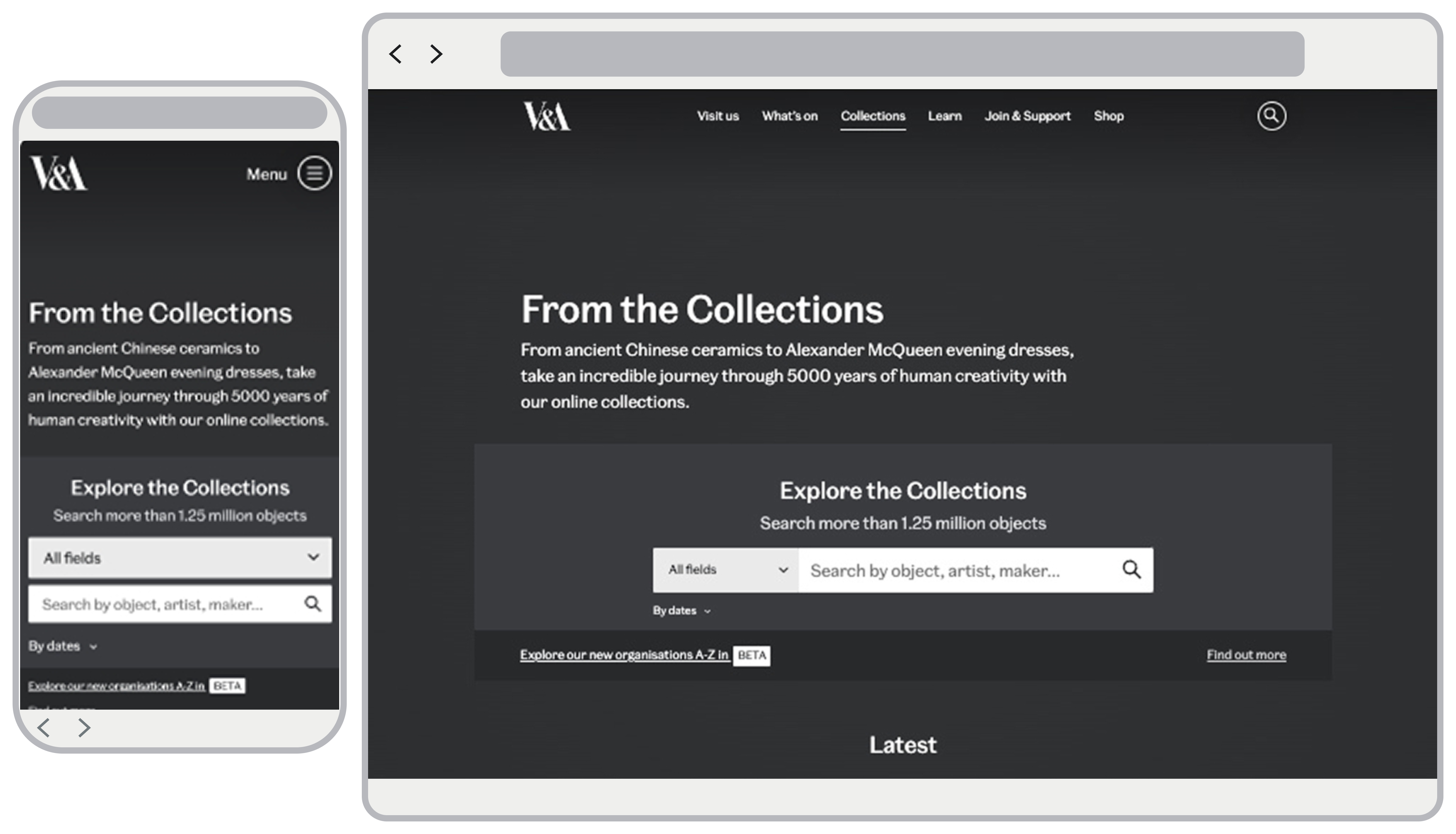
How might we make Explore the Collections clearer, provide multiple entry points for casual users, and ensure the experience is accessible to all?
Process
Wireframing and exploration
Discovery (competitive analysis, GA4 journey analysis, a Hotjar survey and a stakeholder co-design workshop) surfaced three distinct user modes, and a trap: one page that averaged all three would serve none of them. So instead of designing a compromise, I developed two deliberately opposed concepts, each committed to a different mental model, and let testing reveal which one users actually reached for.
Discover
Casual visitors looking for inspiration and easy entry points.
Study
Researchers and students needing structured navigation and search.
Ideate
Creative professionals seeking visual stimulation and curated groupings.
Concept A · Editorial
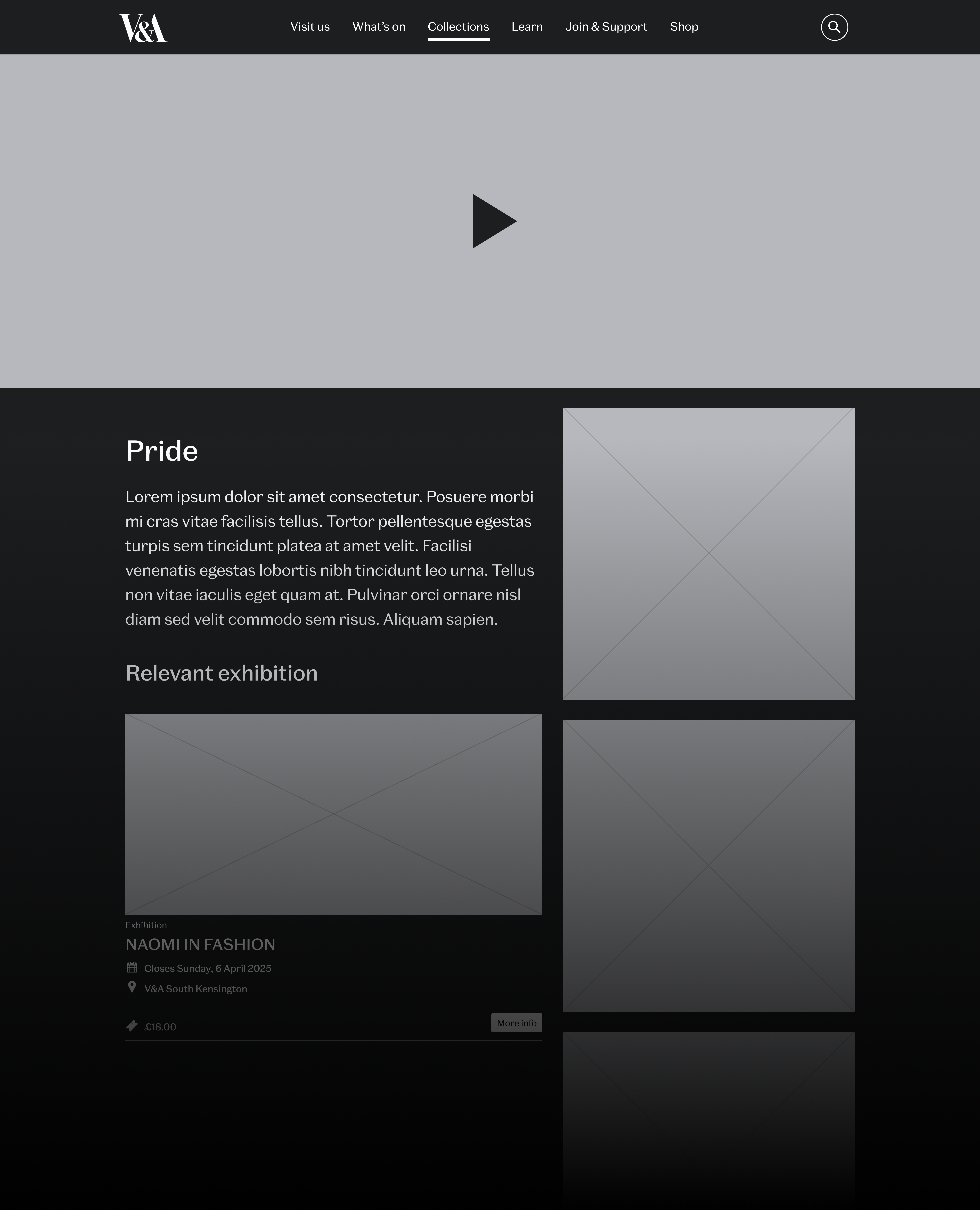
A magazine-like experience with parallax scrolling, bold imagery, and narrative-style storytelling.
Concept B · Interactive
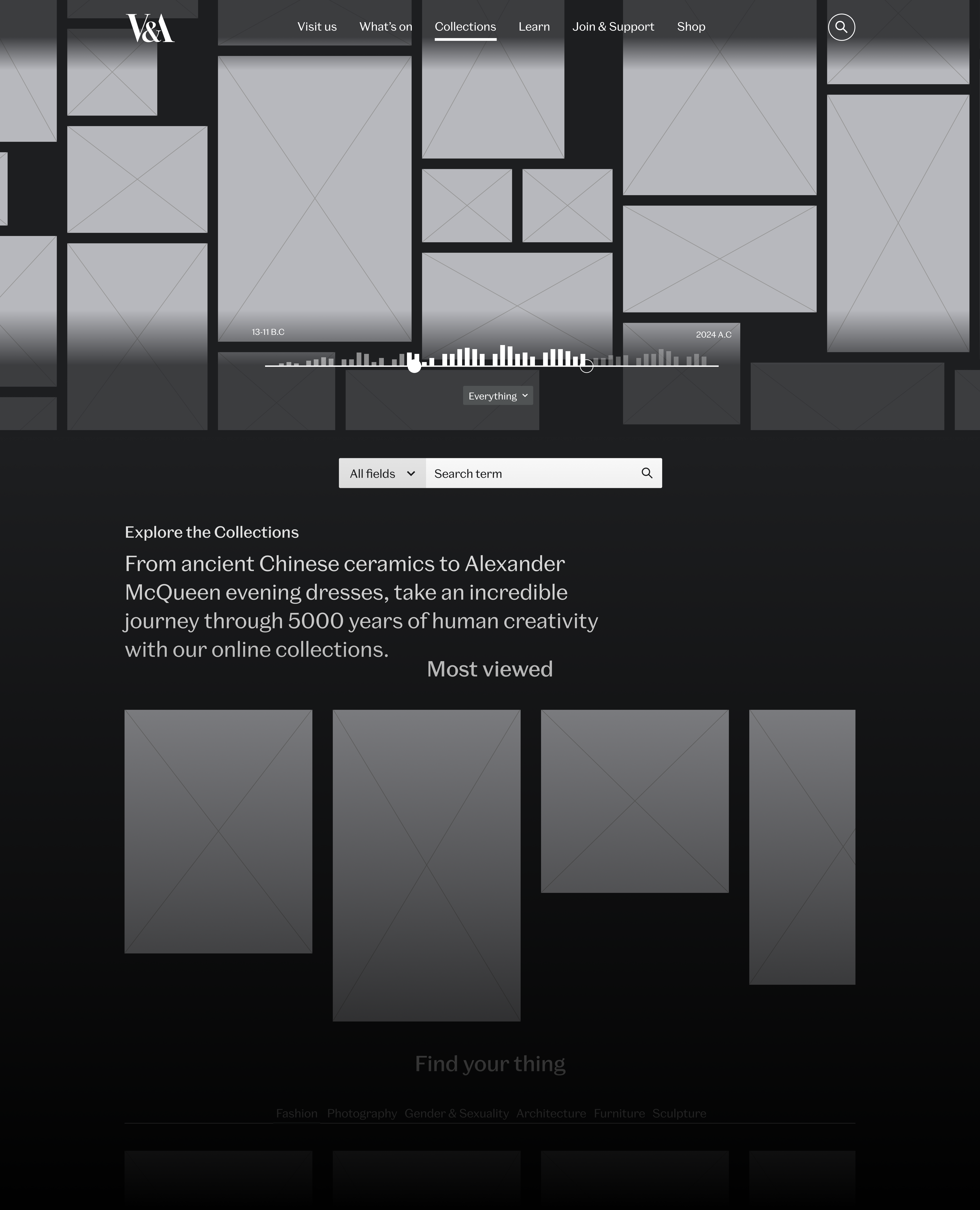
A hands-on design featuring an interactive timeline of objects, encouraging discovery through interaction.
Prototyping
I built both concepts into interactive prototypes rather than testing static sketches. The core question was behavioural - do people want to read, or to play? - and only tangible interaction could answer it honestly. This set up a clean A/B test.
Concept A · Editorial
Polished layouts with a strong visual rhythm and storytelling flow.
Concept B · Interactive
Dynamic timeline interactions with clickable objects and exploratory pathways.
Should Explore the Collections feel like a story you read or an experience you interact with?
User testing
I set the questions the study needed to answer, sat in on sessions and turned the findings into design changes. Working with our researcher, we ran unmoderated A/B testing via Userlytics with 15 museum-going participants - UK-based and international, at least three with access needs - recruited to reflect the Discover, Study and Ideate modes. A second, moderated round followed in beta with six domain experts: V&A front-of-house staff, curators, and RCA History of Design students.
Key insights
No. 01Users appreciated the visual richness and clarity of the editorial design, but some found it too passive for deeper exploration. The timeline interaction in the interactive concept was engaging, but risked overwhelming first-time visitors who expected clearer orientation.
User needs
No. 02A clear orientation statement explaining what Explore the Collections is. Multiple entry points (curated collections, featured highlights, thematic browsing) beyond search. A design that balanced inspiration with usability.
Iterations
No. 03Retained the editorial polish and narrative clarity of Concept A. Incorporated lightweight interactive elements inspired by Concept B, without making them dominant. Refined the information hierarchy in collaboration with the content team.
Final design
Neither concept won outright, and that was the real finding. Users wanted Concept A’s clarity but missed Concept B’s invitation to explore. The final design keeps the editorial spine and admits interaction only where it earns its place:
Multiple “ways in”, curated highlights, thematic collections and featured objects, so casual visitors never face an empty search box. An orientation-first opening that answers “what is this?” in one line, closing the top usability finding. Lightweight interactive moments from Concept B, kept subordinate to reading flow.
Delivered as high-fidelity prototypes with documentation for development.
Outcome and impact
The redesign launched in April 2025, with every design goal mapped to a measurable target. Five months on (April to September 2025), the project outcomes were clear:
Traffic up 40%
Year-on-year growth in landing-page visits, holding a stable share of total sessions even as site-wide traffic hit record highs.
Search reliance down 32%
Visitors leaned on the search bar far less, direct evidence that the new ways in guided discovery through content rather than queries.
22% adopted the new tabs
Thematic entry points drew strong engagement, with 30-40% content click rates in categories like Fashion and Theatre & Performance.
Deeper, longer engagement
Average engagement time up 24%, more visitors scrolling past 25% depth, and an 11.3% carousel click-through with nearly six minutes of post-click engagement.