Case study No. 02 · V&A Museum
Order an Object
Context
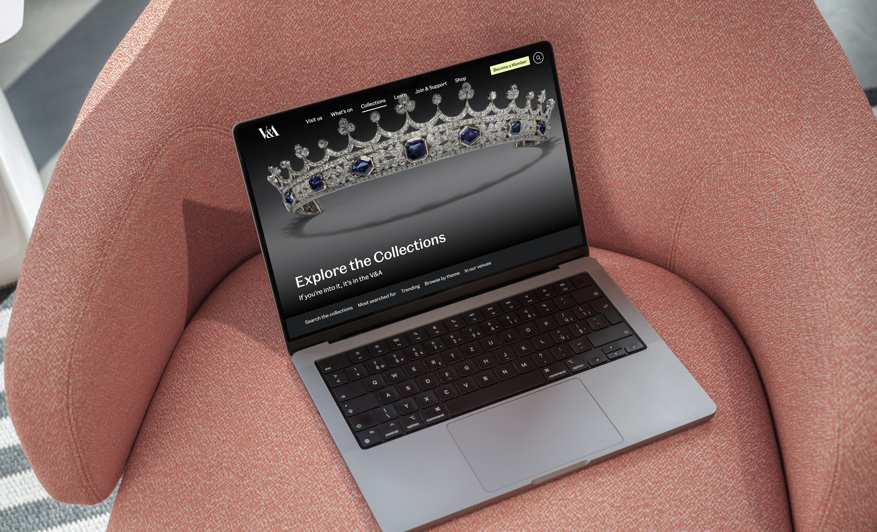
The Victoria and Albert Museum holds a collection of over 1.2 million objects, yet only around 10% are on public display.
Previously, object appointments were restricted to just two locations, the National Art Library and the Prints and Drawings Study Room, and were primarily used by specialists and researchers.
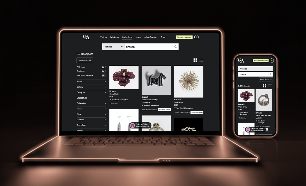
Order an Object is an ambitious new service developed as part of the V&A East Storehouse opening, designed to give the public direct access to stored collections, creating an open, inclusive gateway. The online system allows users to discover, select, and book appointments to view objects in person.
The challenge
Cognitive complexity
No. 01Translating a complex, curator-mediated back-office process into a simple, self-serve digital journey.
Clear information architecture
No. 02Differentiating between objects that can be instantly booked (“Book to view”) and those that require curatorial approval (“Request to view”).
Intuitive action model
No. 03Moving users from a passive “browsing” mindset on the collections website to an active “booking” mindset without confusion.
Technical integration
No. 04Designing a solution that integrates with legacy collection management systems (CMS) and a new external booking platform.
Inclusive design
No. 05Ensuring the service was accessible and clear for users with diverse needs and backgrounds.
How might we redesign the experience so that anyone could discover, select, and book objects with ease?
Process
Wireframing and exploration
The brief called for a list-based system: users would save objects to a list that would later feed a separate booking flow. I wireframed it, and design reviews surfaced two hard truths: the collections CMS couldn’t hold reservations against a saved list, and “save now, book later” hid the five-object appointment limit until the worst possible moment.
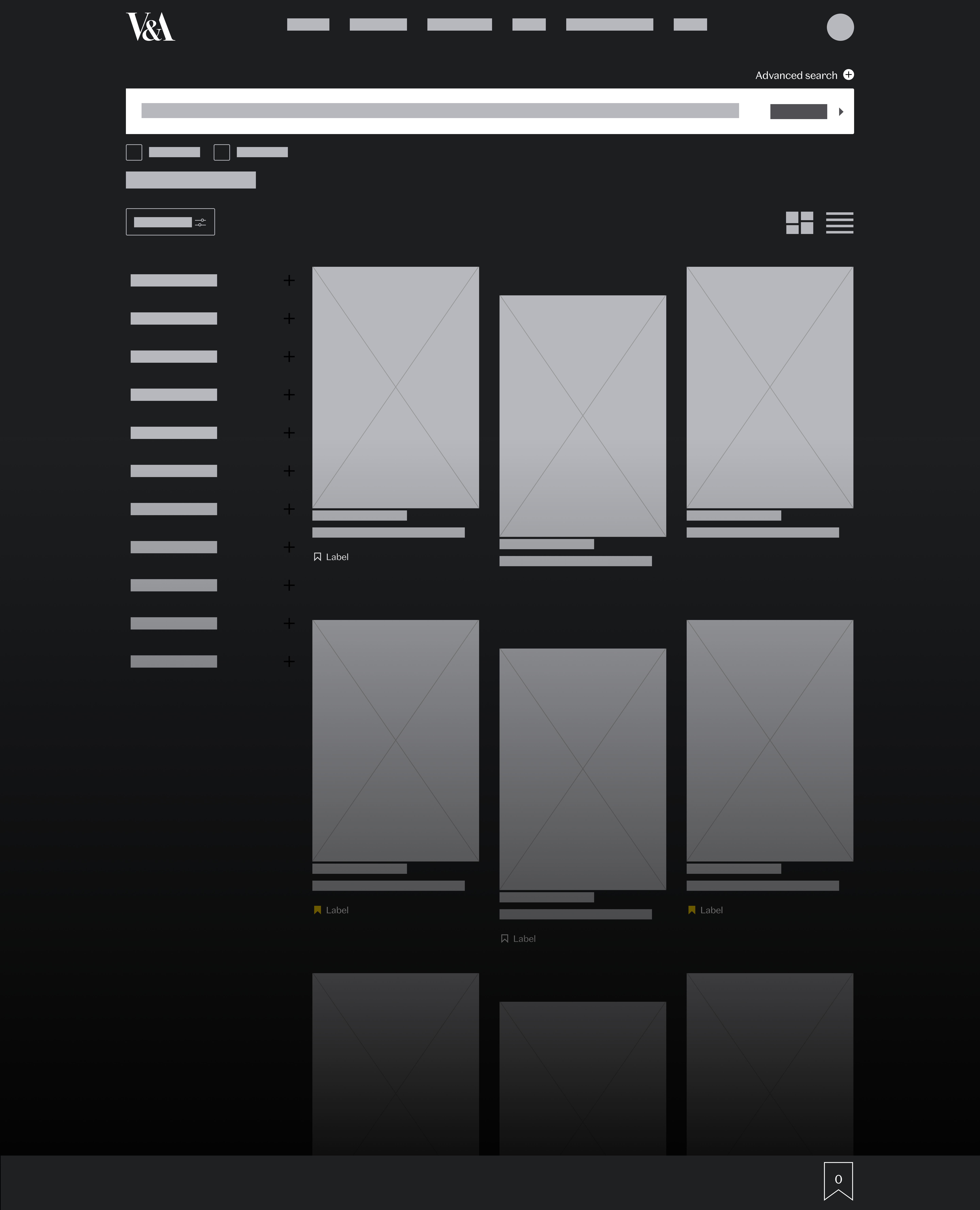
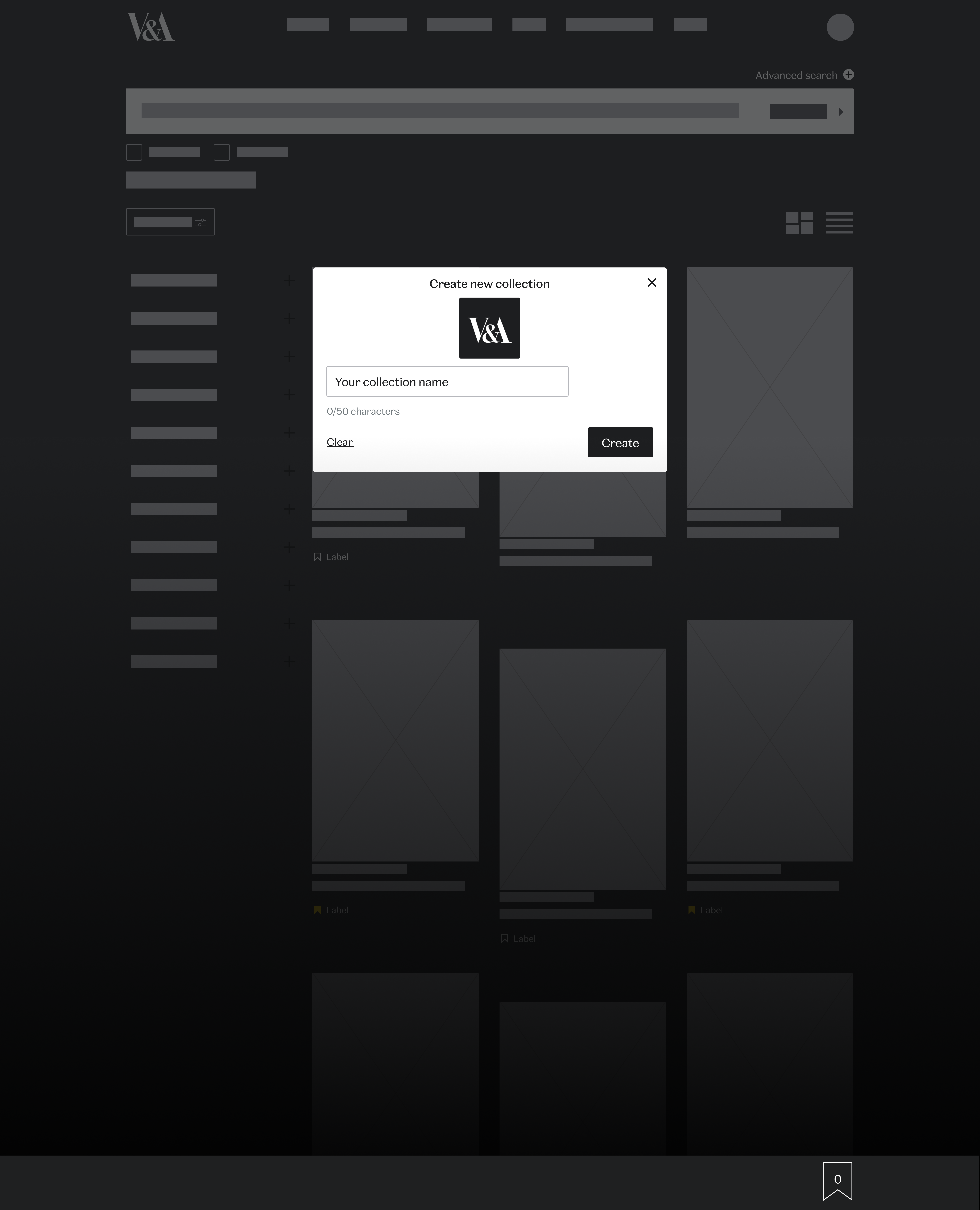
We pivoted to a checkout model that books objects directly. I explored multiple variations of this flow before refining it into high-fidelity wireframes and an interactive prototype for user testing.
Prototyping
With the flows defined, I built high-fidelity prototypes that walked users through the entire journey, from discovery to booking confirmation, so we could judge the service end-to-end, and our UXR could test something that behaved like the real thing.
User testing
Our UXR conducted unmoderated testing via Userlytics with 15 culturally engaged London-based participants aged 23–34, 26% of whom identified accessibility needs. These were the key findings:
Misleading terminology
No. 01Users thought “Add to list” meant saving items, not booking. They expected clearer wording like “Book to view.”
Unclear rules
No. 02The “5 objects per appointment” limit was misunderstood. Some assumed they had to add exactly five.
Low visibility
No. 03The My Objects crate was small and hidden. Some users struggled to notice it, and only found it after significant trial and error.
Final design
Every change below traces to a testing finding, nothing was restyled for its own sake:
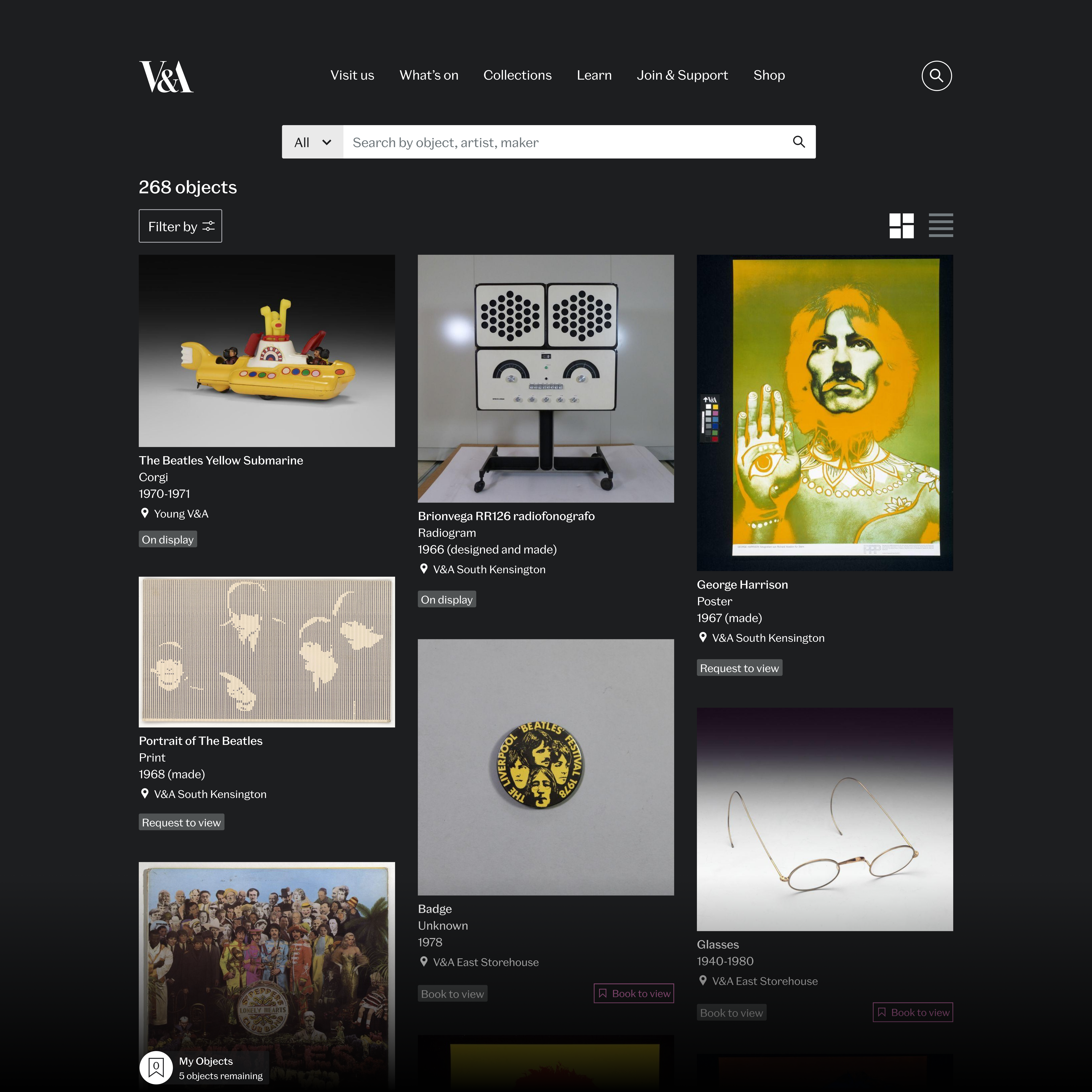
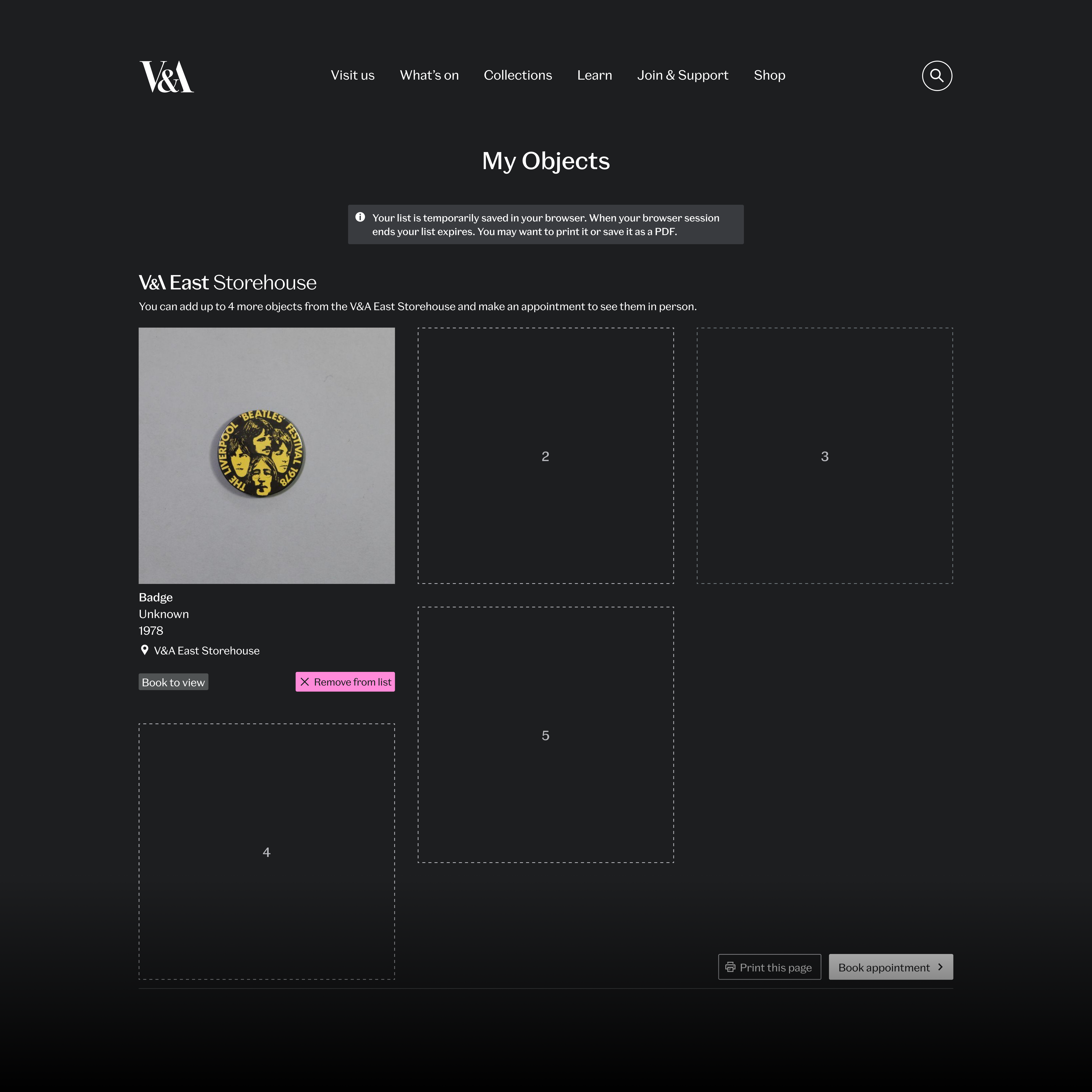
Clearer availability labels in search results, using “View by appointment” for bookable objects (finding No. 01). Main CTA renamed to “Order an Object”, matching the service name and making the action unmistakable (finding No. 01). The My Objects crate enlarged and centred for visibility (finding No. 03). Object Page instructions rewritten to clarify the “up to 5 objects” rule (finding No. 02).
The add-a-guest-with-access-needs flow, which failed for 9 of 15 participants, was rebuilt: the guest count now starts at zero and access requirements attach to a named person (challenge No. 05).
Handed to development as high-fidelity interactive prototypes with documentation.
Outcome and impact
The service launched with the V&A East Storehouse and found its audience fast:
High engagement
23,200+ sessions recorded, creating a brand-new access channel to the collections.
Strong integration
Used in 2.2% of all Explore the Collections sessions, showing fluid integration into the user journey.
Validated core feature
32,450+ objects were added to viewing lists, with users averaging 3.15 objects per list.
Successful conversion
28.53% of interactions proceeded to book, indicating a clear user path.