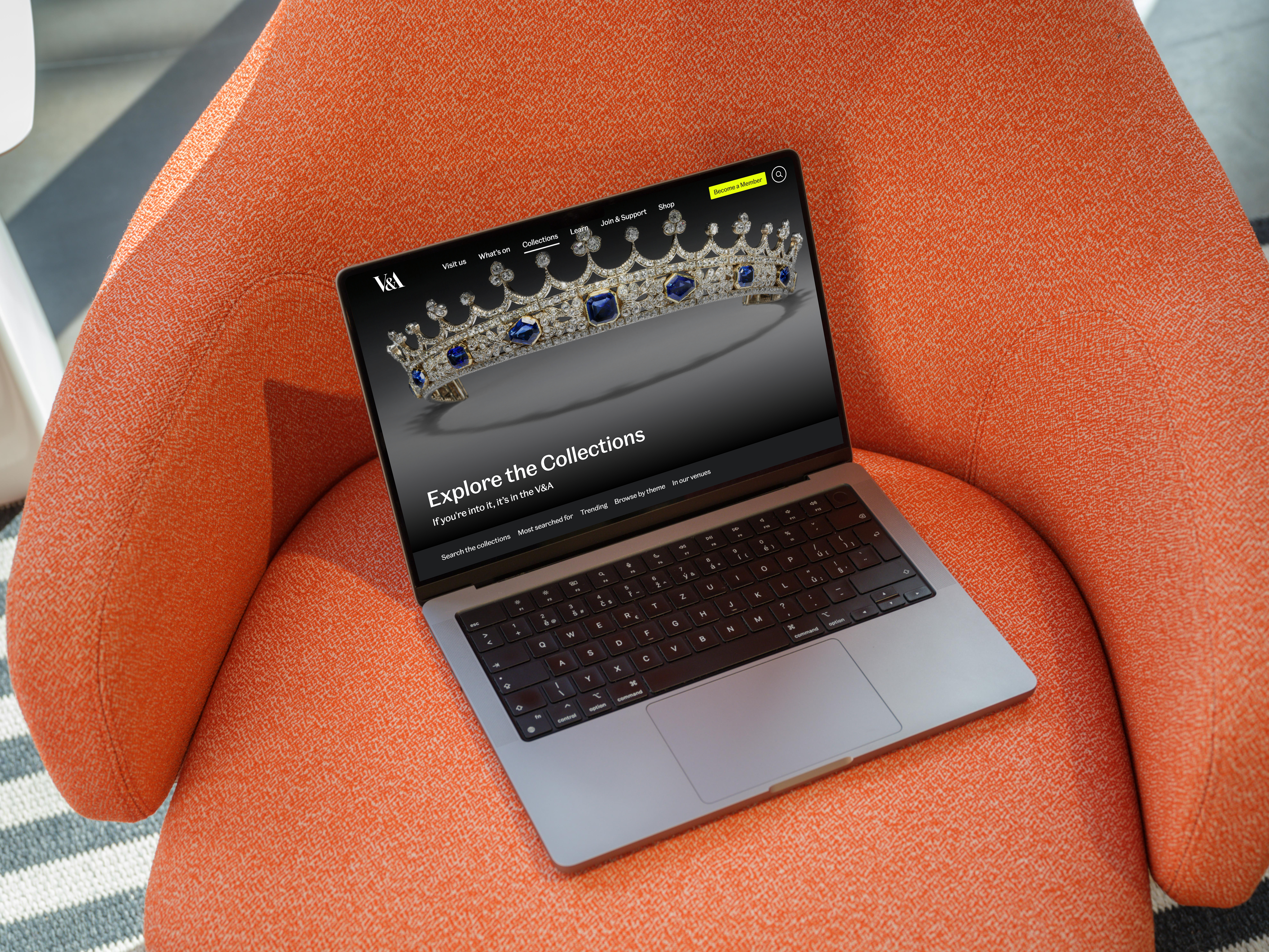
Explore the Collections
Context
The Victoria and Albert Museum houses millions of objects that tell the story of art, design, and human creativity. Explore the Collections is the museum’s digital front door. It isn’t just a tool to search objects, it’s an experience designed to spark curiosity, support research, and inspire creativity across cultures.
View website
Overview
Role
Product Designer (End to end UI/UX)
Company
V&A Museum
Duration
6 months
Team
1 Product Manager; 1 Product Designer (me); 1 User Researcher; 2 Developers; 2 Content Editors
Problem
Analytics and user research revealed that visitors struggled with the landing page.
Unclear proposition
01
Users were unclear about what Explore the Collections actually was (exhibition, database, or museum information).
Overwhelming navigation
02
Navigation felt overwhelming, with too few “ways in” for casual users who lacked specific search terms.
Accessibility issues
03
Users with accessibility requirements faced barriers exploring the collections independently.
Previous design
How might we make Explore the Collections clearer, provide multiple entry points for casual users, and ensure the experience is accessible to all?
Process
Wireframing and Exploration
I began by developing two different concepts considering our user modes:
Discover
Casual visitors looking for inspiration and easy entry points.
Study
Researchers and students needing structured navigation and search.
Ideate
Creative professionals seeking visual stimulation and curated groupings.
Concept A - Editorial
A magazine-like experience with parallax scrolling, bold imagery, and narrative-style storytelling.
Concept B - Interactive
A hands-on design featuring an interactive timeline of objects, encouraging discovery through interaction.
Prototyping
I developed both concepts into interactive prototypes, making them ready for A/B testing. This allowed users to experience the designs directly and provide feedback on tangible interactions rather than abstract sketches.
Concept A - Editorial
Polished layouts with a strong visual rhythm and storytelling flow.
Concept B - Interactive
Dynamic timeline interactions with clickable objects and exploratory pathways.
Should Explore the Collections feel like a story you read or an experience you interact with?
User testing
Our UXR conducted unmoderated A/B testing with 15 participants (mix of casual visitors, researchers, and creative professionals). The group included UK-based and international users, with accessibility needs represented to ensure inclusivity.
Key insights
01
- Users appreciated the visual richness and clarity of the editorial design, but some found it too passive for deeper exploration.
- The timeline interaction in the interactive concept was engaging, but risked overwhelming first-time visitors who expected clearer orientation.
User needs
02
- A clear orientation statement explaining what Explore the Collections is.
- Multiple entry points (curated collections, featured highlights, thematic browsing) beyond search.
- A design that balanced inspiration with usability.
Iterations
03
- Retained the editorial polish and narrative clarity of Concept A.
- Incorporated lightweight interactive elements inspired by Concept B, without making them dominant.
- Refined the information hierarchy in collaboration with the content team.
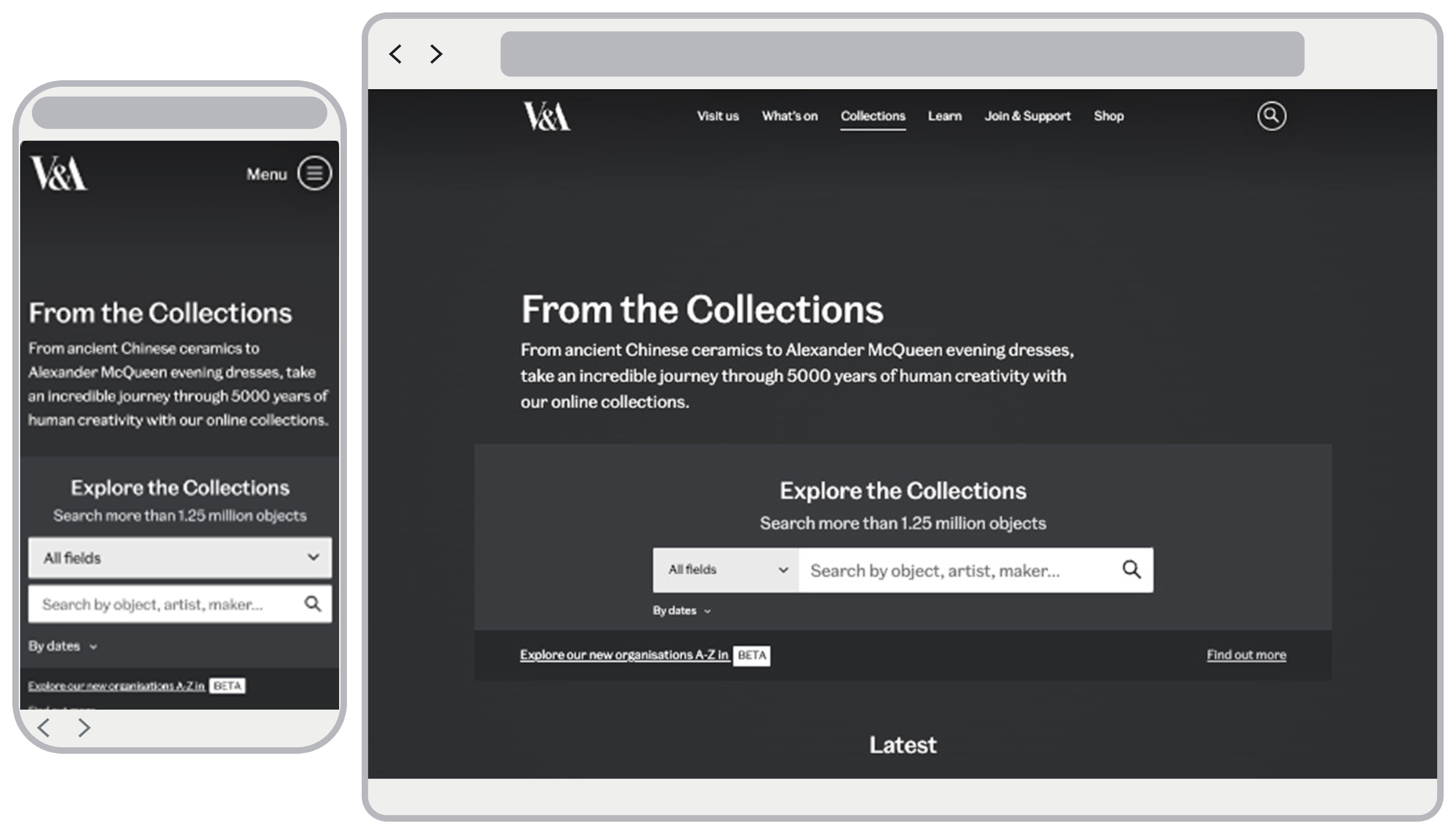
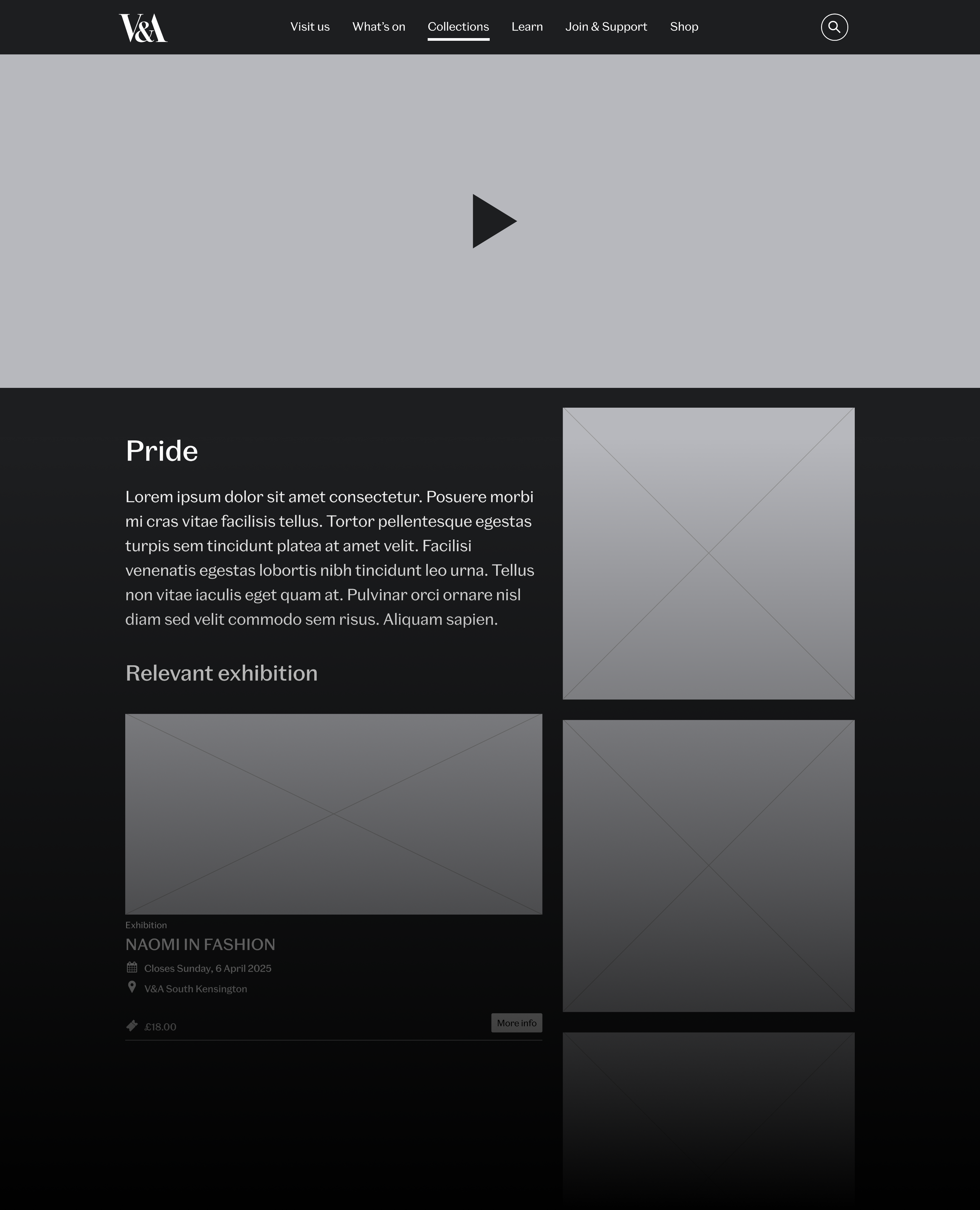
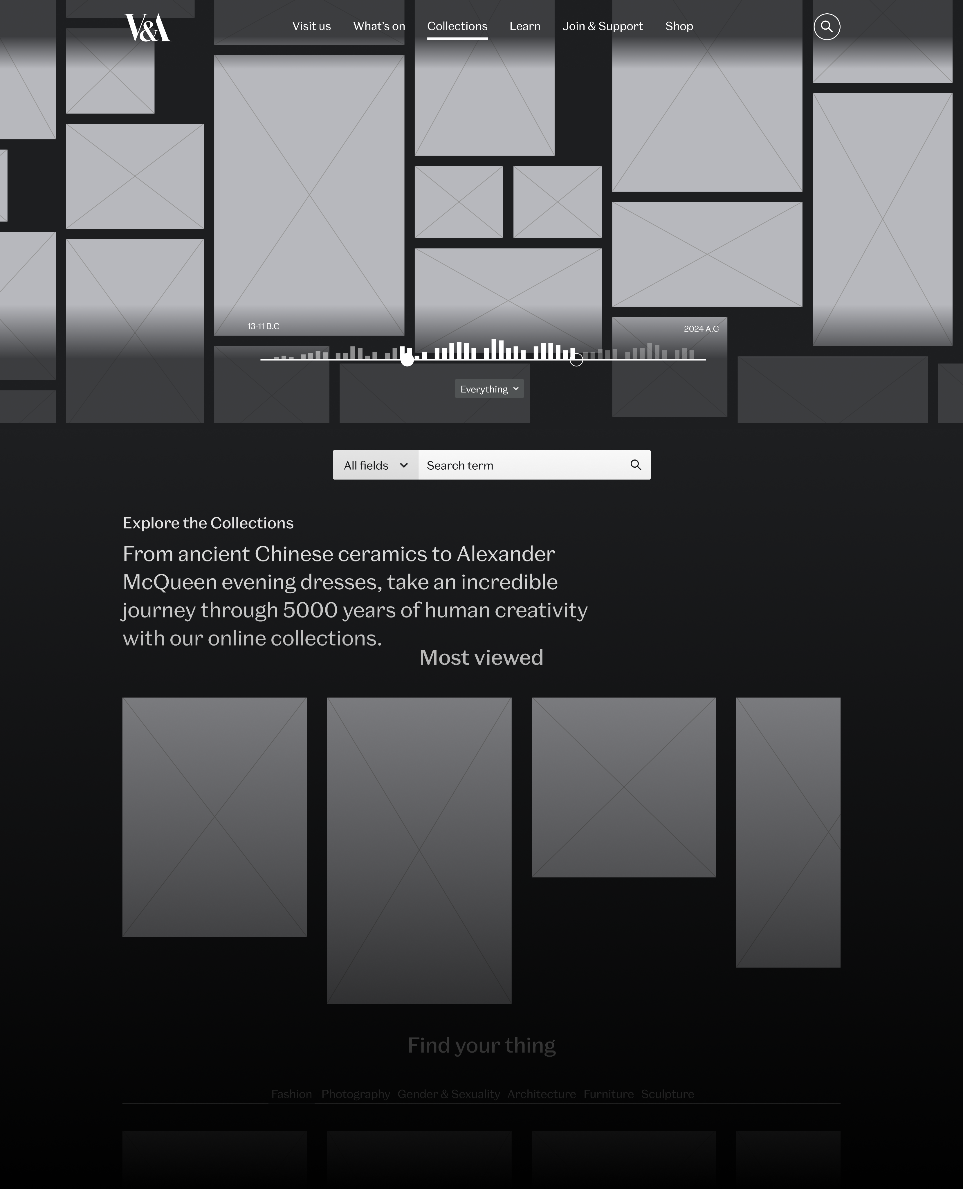
Final design
The final design consisted of a blended version of Concept A and Concept B. It was delivered through high-fidelity interactive prototypes and documentation for development. Key features included:
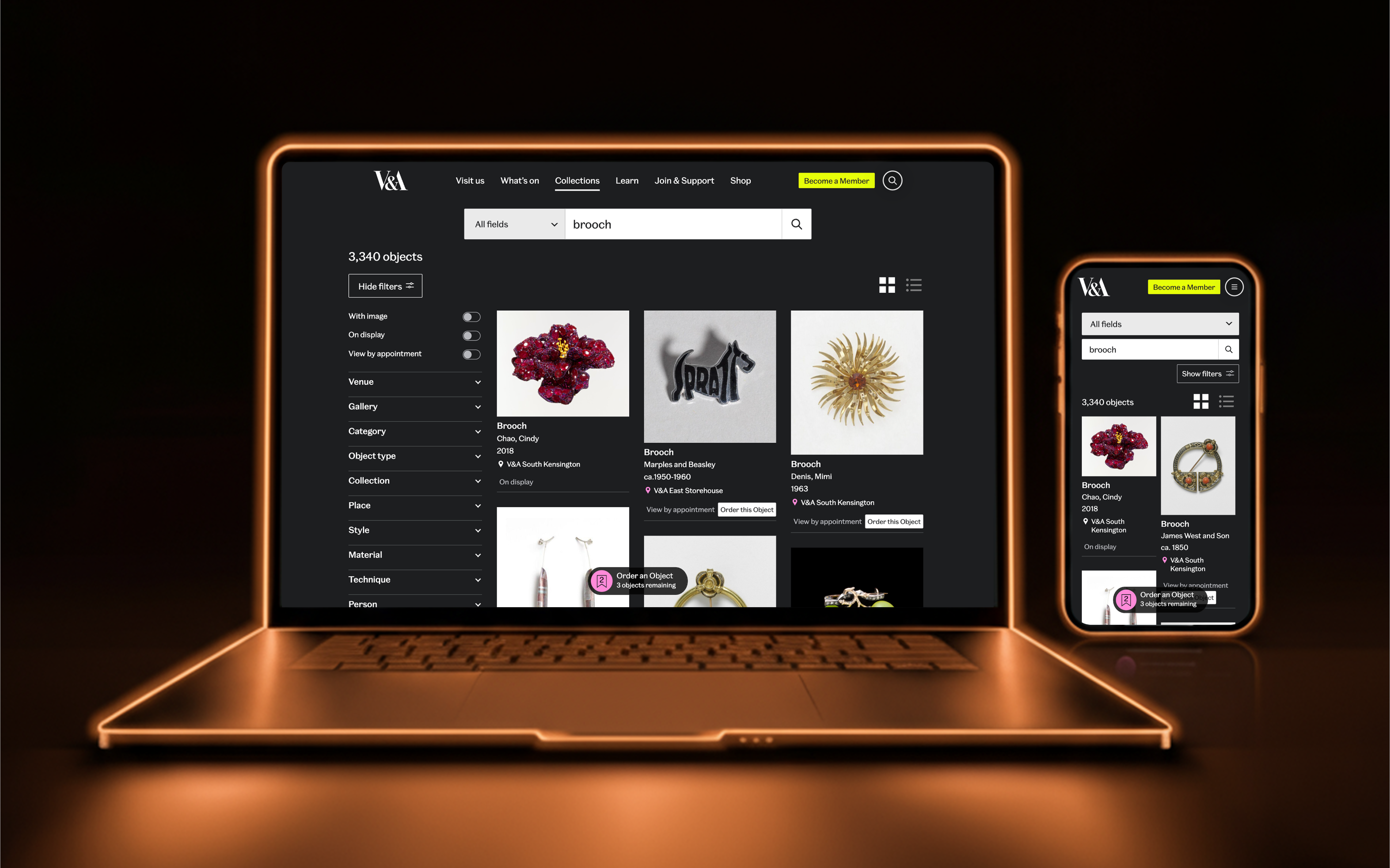
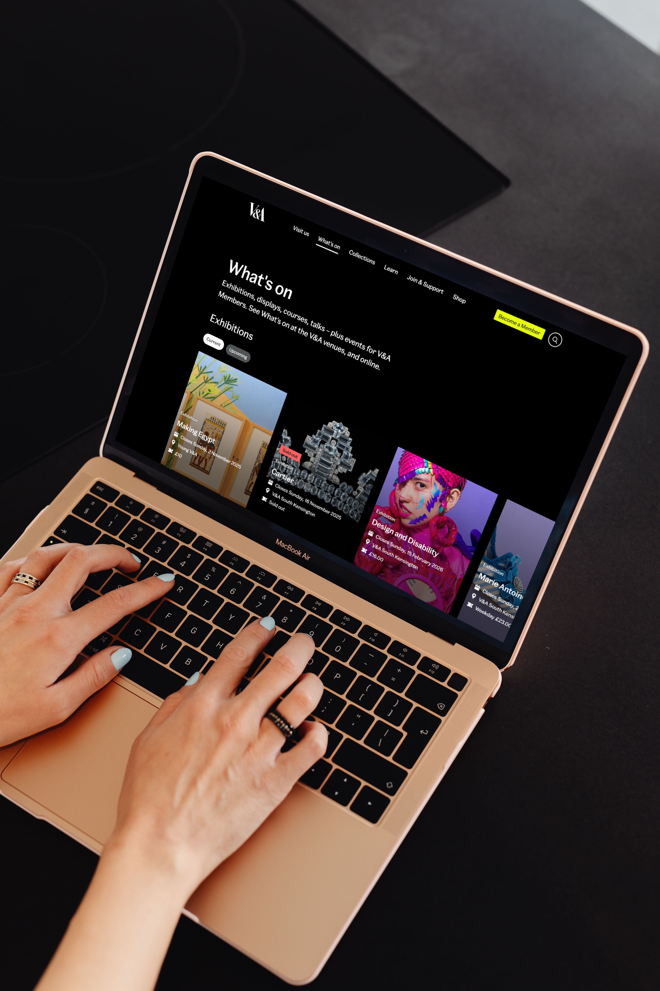
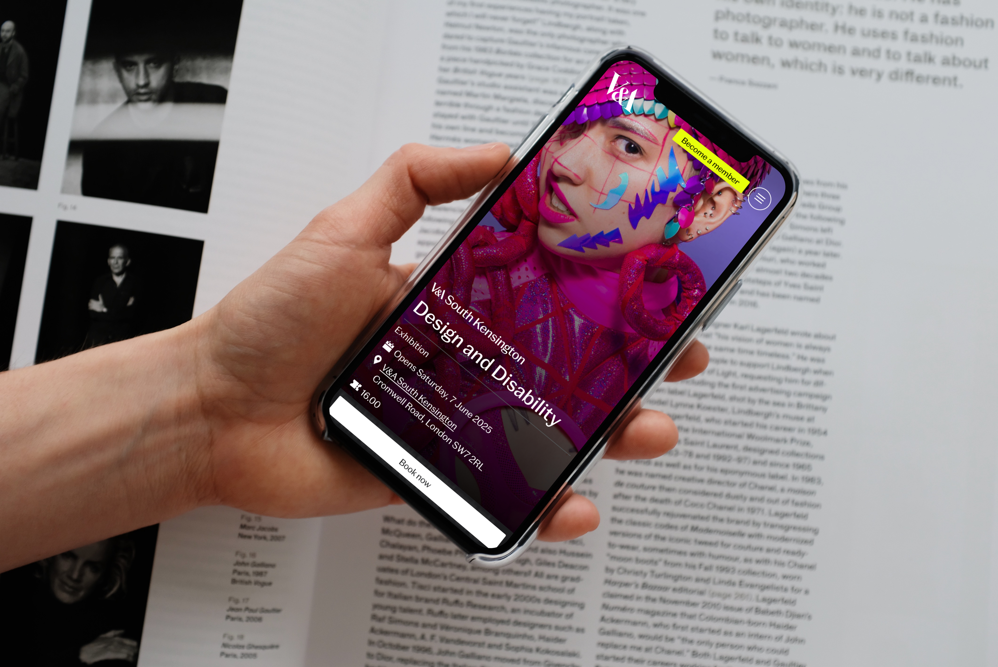
- Multiple “ways in”: intuitive search, curated highlights, thematic collections, and featured objects.
- Accessibility compliance (WCAG 2.2): keyboard navigation, screen reader compatibility, simplified UI for cognitive accessibility.
- A visually rich, inspiring interface leveraging high-quality imagery.
View website
Outcome and impact
The redesign successfully transformed the digital collections experience, leading to significant, measurable improvements across key engagement and accessibility metrics.
+35% engagement
+35% increase in engagement post-launch, as tracked in analytics.
Reduced drop-off
Users explored multiple collection items per session, reducing single-page drop-off.
Improved accessibility
AA+ WCAG compliance made the collections more inclusive and accessible to wider audiences.
Scalable design
Established a scalable design framework for future features such as advanced search and thematic browsing.
Explore the Collections
Context
The Victoria and Albert Museum houses millions of objects that tell the story of art, design, and human creativity. Explore the Collections is the museum’s digital front door. It isn’t just a tool to search objects, it’s an experience designed to spark curiosity, support research, and inspire creativity across cultures.
View website
Overview
Role
Product Designer (End to end UI/UX)
Company
V&A Museum
Duration
6 months
Team
1 Product Manager; 1 Product Designer (me); 1 User Researcher; 2 Developers; 2 Content Editors
Problem
Analytics and user research revealed that visitors struggled with the landing page.
Unclear proposition
01
Users were unclear about what Explore the Collections actually was (exhibition, database, or museum information).
Overwhelming navigation
02
Navigation felt overwhelming, with too few “ways in” for casual users who lacked specific search terms.
Accessibility issues
03
Users with accessibility requirements faced barriers exploring the collections independently.
Previous design
How might we make Explore the Collections clearer, provide multiple entry points for casual users, and ensure the experience is accessible to all?
Process
Wireframing and Exploration
I began by developing two different concepts considering our user modes:
Discover
Casual visitors looking for inspiration and easy entry points.
Study
Researchers and students needing structured navigation and search.
Ideate
Creative professionals seeking visual stimulation and curated groupings.
Concept A - Editorial
A magazine-like experience with parallax scrolling, bold imagery, and narrative-style storytelling.
Concept B - Interactive
A hands-on design featuring an interactive timeline of objects, encouraging discovery through interaction.
Prototyping
I developed both concepts into interactive prototypes, making them ready for A/B testing. This allowed users to experience the designs directly and provide feedback on tangible interactions rather than abstract sketches.
Concept A - Editorial
Polished layouts with a strong visual rhythm and storytelling flow.
Concept B - Interactive
Dynamic timeline interactions with clickable objects and exploratory pathways.
Should Explore the Collections feel like a story you read or an experience you interact with?
User testing
Our UXR conducted unmoderated A/B testing with 15 participants (mix of casual visitors, researchers, and creative professionals). The group included UK-based and international users, with accessibility needs represented to ensure inclusivity.
Key insights
01
- Users appreciated the visual richness and clarity of the editorial design, but some found it too passive for deeper exploration.
- The timeline interaction in the interactive concept was engaging, but risked overwhelming first-time visitors who expected clearer orientation.
User needs
02
- A clear orientation statement explaining what Explore the Collections is.
- Multiple entry points (curated collections, featured highlights, thematic browsing) beyond search.
- A design that balanced inspiration with usability.
Iterations
03
- Retained the editorial polish and narrative clarity of Concept A.
- Incorporated lightweight interactive elements inspired by Concept B, without making them dominant.
- Refined the information hierarchy in collaboration with the content team.
Final design
The final design consisted of a blended version of Concept A and Concept B. It was delivered through high-fidelity interactive prototypes and documentation for development. Key features included:
- Multiple “ways in”: intuitive search, curated highlights, thematic collections, and featured objects.
- Accessibility compliance (WCAG 2.2): keyboard navigation, screen reader compatibility, simplified UI for cognitive accessibility.
- A visually rich, inspiring interface leveraging high-quality imagery.
View website
Outcome and impact
The redesign successfully transformed the digital collections experience, leading to significant, measurable improvements across key engagement and accessibility metrics.
+35% engagement
+35% increase in engagement post-launch, as tracked in analytics.
Reduced drop-off
Users explored multiple collection items per session, reducing single-page drop-off.
Improved accessibility
AA+ WCAG compliance made the collections more inclusive and accessible to wider audiences.
Scalable design
Established a scalable design framework for future features such as advanced search and thematic browsing.
Explore the Collections
Context
The Victoria and Albert Museum houses millions of objects that tell the story of art, design, and human creativity. Explore the Collections is the museum’s digital front door. It isn’t just a tool to search objects, it’s an experience designed to spark curiosity, support research, and inspire creativity across cultures.
View website
Overview
Role
Product Designer (End to end UI/UX)
Company
V&A Museum
Duration
3 months
Team
1 Product Manager; 1 Product Designer (me); 1 User Researcher; 2 Developers; 2 Content Editors
Problem
Analytics and user research revealed that visitors struggled with the landing page.
Unclear proposition
01
Users were unclear about what Explore the Collections actually was (exhibition, database, or museum information).
Overwhelming navigation
02
Navigation felt overwhelming, with too few “ways in” for casual users who lacked specific search terms.
Accessibility issues
03
Users with accessibility requirements faced barriers exploring the collections independently.
Previous design
How might we make Explore the Collections clearer, provide multiple entry points for casual users, and ensure the experience is accessible to all?
Process
Wireframing and Exploration
I began by developing two different concepts considering our user modes:
Discover
Casual visitors looking for inspiration and easy entry points.
Study
Researchers and students needing structured navigation and search.
Ideate
Creative professionals seeking visual stimulation and curated groupings.
Concept A - Editorial
A magazine-like experience with parallax scrolling, bold imagery, and narrative-style storytelling.
Concept B - Interactive
A hands-on design featuring an interactive timeline of objects, encouraging discovery through interaction.
Prototyping
I developed both concepts into interactive prototypes, making them ready for A/B testing. This allowed users to experience the designs directly and provide feedback on tangible interactions rather than abstract sketches.
Concept A - Editorial
Polished layouts with a strong visual rhythm and storytelling flow.
Concept B - Interactive
Dynamic timeline interactions with clickable objects and exploratory pathways.
Should Explore the Collections feel like a story you read or an experience you interact with?
User testing
Our UXR conducted unmoderated A/B testing with 15 participants (mix of casual visitors, researchers, and creative professionals). The group included UK-based and international users, with accessibility needs represented to ensure inclusivity.
Key insights
01
- Users appreciated the visual richness and clarity of the editorial design, but some found it too passive for deeper exploration.
- The timeline interaction in the interactive concept was engaging, but risked overwhelming first-time visitors who expected clearer orientation.
User needs
02
- A clear orientation statement explaining what Explore the Collections is.
- Multiple entry points (curated collections, featured highlights, thematic browsing) beyond search.
- A design that balanced inspiration with usability.
Iterations
03
- Retained the editorial polish and narrative clarity of Concept A.
- Incorporated lightweight interactive elements inspired by Concept B, without making them dominant.
- Refined the information hierarchy in collaboration with the content team.
Final design
The final design consisted of a blended version of Concept A and Concept B. It was delivered through high-fidelity interactive prototypes and documentation for development. Key features included:
- Multiple “ways in”: intuitive search, curated highlights, thematic collections, and featured objects.
- Accessibility compliance (WCAG 2.2): keyboard navigation, screen reader compatibility, simplified UI for cognitive accessibility.
- A visually rich, inspiring interface leveraging high-quality imagery.
View website
Outcome and impact
The redesign successfully transformed the digital collections experience, leading to significant, measurable improvements across key engagement and accessibility metrics.
+35% engagement
+35% increase in engagement post-launch, as tracked in analytics.
Reduced drop-off
Users explored multiple collection items per session, reducing single-page drop-off.
Improved accessibility
AA+ WCAG compliance made the collections more inclusive and accessible to wider audiences.
Scalable design
Established a scalable design framework for future features such as advanced search and thematic browsing.
Other projects